
Posted on 2014-Mar-19
No Hard Rules, but Keep Consistent
There aren’t any definitive rules for how the different sections of front matter in an eBook should be organized, and it is very unlikely that your book will be rejected for publishing based on how you have structured it (except for Smashwords, the nitpicky ones). However, there are some best practices that we recommend to our clients for their front matter that are heavily influenced by how The Chicago Manual of Style identifies a print book look. Whatever way you choose to present your front matter, it is best to keep structured in a similar fashion with all the eBooks you publish to give your reader a consistent experience. Let’s talk about the different sections associated with front matter first.
The Many Types of Front Matter
For those who are too afraid to ask, here is a glossary of the different sections of front matter and what they are:
Half Title: This is often the first page with just the title of the book (i.e. no author name or subtitle); this is usually only seen in print books and is not necessary for eBooks.
Blurb: This marketing copy can be one or two paragraphs about the book. It is not required, but often good to have on the first page as voracious readers who own hundreds of eBooks may forget what the book is about when they open it up. The blurb can also be embedded in the metadata of the eBook, but very few reading systems (Kobo for iPad and Calibre are a few exceptions) use the blurb metadata embedded in the EPUB file. It is advantageous to actually have the blurb within the content of the book itself.
Reviews/Praise: These include rave reviews of the book on a page by itself from journals, other authors, book bloggers, and fans. This section is typically before or after the Title Page.
Also by the Author: A list of other works by the author; however, we recommend this be placed in the back to entice the reader to buy more of your books after they are finished. (Please see more about promotion of your other eBooks with buy links).
Promotional Hyperlinks: A list of links to the author’s website, social media, etc. These can appear on a page by themselves or, more frequently, on the Title Page or Copyright Page. We typically recommend this go in the back matter of the book with the other promotional material, but many successful authors like Carly Phillips put this up front.
Frontispiece: This is very traditional, and it is an illustration designed to be on the left-hand page facing the Title Page for the print edition. This should not be the cover. A frontispiece works great for eBooks too if you have an interesting illustration that wasn’t used on the cover. We recommend placing it after the Title Page.
Title Page: This is simply the title, subtitle, and author(s) name(s). For print books, it is customary to have the publisher’s name, a small logo, and the city where the publisher’s offices are located. While a publishing imprint may seem a bit unnecessary—and even pretentious—for indie authors, we recommend it to add professionalism to your brand.
Copyright Page: This is the most complicated part of the front matter and it includes the full copyright notice, information on the edition, publisher’s address, an ISBN (if there is one), and an “All rights reserved” statement. For more details on the Copyright Page, please see here.
Dedication: A short, heartfelt note from the author to someone important in their life (a mentor, family member, a kind reader who helped propel them to fame, etc.). This is usually no more than one sentence and is in italics.
Table of Contents: This is a comprehensive list of headings and subheads that allow the reader to understand how the book is structured and facilitates discoverability and navigation. The Table of Contents is not required for print books (and almost always unnecessary for novels), but a Table of Contents is always required for eBooks. More on the Table of Contents here.
Epigraph: A quote from a famous body of work or notable quotable from a well-known living or dead person that can tangentially relate to the book itself in a clever way. The quote is usually on a page all by itself with the name of the person followed by the work cited. An example of an Epigraph for the next great post-apocalyptic novel would be “When there’s no more room in hell, the dead will walk the earth.” —George Romero, Dawn of the Dead. Important Note: please be careful about quoting song lyrics as this can be considered a copyright violation.
Acknowledgments: A display of gratitude for people who helped make the book possible (your editor, your beta readers, your street team, etc.) This is also a good time to make liberal use of hyperlinks to payback those who helped you with your book who may not have been compensated. You can also cite trademark acknowledgments if you feel it is necessary—as an example if your book makes numerous references to M&Ms you could acknowledge the M&M trademark by Mars Inc. Please note: there is ambiguity over whether there is an “e” between the “g” and “m” in Acknowledgments (i.e. Acknowledgments or Acknowledgements). We prefer Acknowledgments since that’s how The Chicago Manual of Style spells it.
Foreword: This section is usually a few pages and contains remarks about the book that are written by someone other than the author. At the end of the Foreword, it is recommended that the person’s name be listed along with their credentials. These are typically only for works of non-fiction. Please note: it is not spelled “Forward.”
Preface: This section contains remarks about the book that are written by the author, usually in the first-person. For a classy touch, the author can add their name at the end like they are signing it. Like the Foreword, the Preface is typically only seen in works of non-fiction.
Recommended Order of Front Matter
There is a significant amount of material that can go in the front matter, and it is best left to the author to determine how much or how little is needed. One thing to be mindful of is that if there is too much front matter, a potential reader may not be able to get to the first chapter when sampling with the “Look Inside” feature on Amazon—this is especially true for shorter novellas/novelettes. It is common for many authors to move the Copyright Page and Acknowledgments to the back matter. Also, please be aware that Smashwords may or may not prevent your book from going Premium if the Title Page isn’t the first page of the eBook.
We recommend the following order for front matter:
- Blurb
- Reviews/Praise (if any)
- Title Page
- Frontispiece (if any)
- Copyright Page
- Dedication (if any)
- Table of Contents
- Acknowledgments (if any)
- Foreword (non-fiction only)
- Preface (non-fiction only)
- Epigraph (if any)
- Prologue/Chapter One…
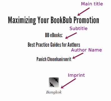
Example of a Title Page
Title pages generally are centered and have the following order: 1) Main title, 2) Subtitle, 3) Author Name, and 4) Imprint (if any). The imprint is usually on the very bottom of the page for print books, but it is not possible at this time to force something to the bottom page for eBooks (unless you are doing a Fixed-Layout eBook), since the bottom of the page on a Kindle Fire might be the middle of page two on an iPhone. Some trade publishers will embed an image as the Title Page to force everything onto one page, but this does not scale well to all eReading devices: reflowable text is a much better solution in our opinion. We recommend that the main title and subtitle be bold, and that the author name be regular text that is slightly larger than the body content, but this is a matter of author preference. Sometimes it may look good to have everything in the same font (in the example below the font is League Gothic). Below is an example of a Title Page:
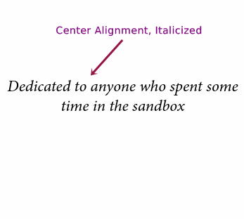
Example of a Dedication
For the Dedication, it usually is not necessary to have the heading “Dedication” at the top. Rather, center-aligned, italicized text in a font size slightly bigger than the body content will look great and your reader will clearly understand that it’s a dedication from the author. Again, it is not possible to vertically center the dedication on the eBook’s “page”, but you can add some white space above the text to offset the dedication slightly. Below is an example of a Dedication:
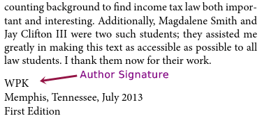
Example of a Preface
On the Preface (or Foreword), the content should follow with a “signature” of the person who wrote it. This could be the typed-out full name or initials. If you would like to get fancy, you can embed a PNG of the hand-drawn signature itself. It is also customary to include the month, year, and location. Below is an example for the end of the Preface section:
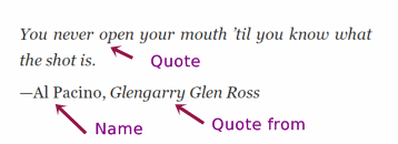
Example of an Epigraph
The Epigraph should start on its own page and contain a succinct 1–4 line notable quotable. The quote is typically flush left rather than centered, but again that is a matter of author preference. To credit who wrote or spoke the famous saying, it is recommended to make the name not italicized and the body of work (if applicable) italicized. Below is an example:
Label: Technical and Design
comments powered by Disqus