
Posted on 2012-Jul-23
There have been some complaints that self-publishers are unprofessional, boorish, and the Rodney Dangerfields of the creative community. One of the criticisms is that publishing houses maintain retain their competitive advantage through costly editing, design, and marketing, and self-publishers do not have the financial resources to properly secure these services. Considering most mid-list authors have their editing farmed out to the lowest bidder and marketing from the publishing houses is shoddy at best, let’s take a closer examination of eBook design.
Both print book and eBook design from the publishing houses is typically sub-contracted to India. This is all well and good, but it adds the following problems to eBook publishing:
- Another layer of separation and bureaucracy between the author and the finished product
- Slow turnaround times and approvals that can’t keep up with technology
- Quality control issues
Perusing my own library of eBooks on the Kindle, I’ve come across some of the following design issues from the big publishing houses. While these may seem trite, we should expect nothing less than perfection as readers who are shelling out over $10 for a digital good. Let’s take a look below (please note I’m a big non-fiction person).
Ugly Dropcaps with Defined Colors

This is from the Charles Murray book Coming Apart: The State of White America, 1960-2010, which was a rather dull read that I only gave two stars. If you look closely, you will notice that a color is used on the dropcaps. This is problematic for the reader, because when they alter the background theme (sepia, white, and black are options on the Kindle) a dropcap with color applied may not show up very well or at all. You should never use a defined color in body content.
No Footnotes

While I thoroughly enjoyed Chris Hayes’ Twilight of the Elites: America After Meritocracy, I thought he was being lazy by not including any footnotes in his book. Unfortunately for Chris and his readers, the publishing house decided to include all the footnotes in a section in the back…with no way of knowing what they were referencing. It is considered a good practice to create cross-references between the content and the footnote section, and the accessibility for this eBook could have been greatly improved with a few hours of extra work.
Uploading a PDF to the Amazon Kindle Store is Asking for Trouble
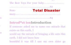
Publishers beware! If you upload a PDF document that was laid out for print directly to the Amazon KDP, you will have a lot of angry readers on your hands. This is a screen shot from a baby book that my mother bought me when my daughter was born. It is terrible in every sense of the word.
Erroneous Metadata

I’m not going to invite political-themed comments by stating whether or not I agree with Dick Cheney. However, I will note that the eBook In My Time was very well-designed, except for a metadata issue. If you look closely, you will notice that it lists two authors separated by a semi-colon for the author metadata. Not only does this look odd, but it is not in accordance with the IDPF’s guidance on the matter, which says that a single primary author should be listed as opposed to multiple authors on one line.
Poor Section Breaks

The Steve Jobs’ biography, simply titled Steve Jobs, is truly a fascinating read and well worth the price. However, blank lines to indicate section breaks is a poor practice in eBooks. This is because the blank line can end up at the top or bottom of the page, confusing the reader whether or not there is actually a section break. Using a simple line, vignette, or even a “***” is much preferable.
Why Self-Publishing Facilitates Better eBook Design
The main benefit of self-publishing is that the author is in complete control of the overall process. Whether a self-publisher does his own eBook design or he hires someone like BB eBooks to do it for him, it provides the following benefits for readers:
- eBook Design that reflects the author’s meaning and tone
- Rapid and immediate changes to the eBook to accommodate fast-changing technology requirements
- Better quality and a commitment to perfection
Whether you do your own eBook formatting and design or you hire out someone on a fee-for-service basis, you as the author can assure that your eBook will look professional and be enjoyable for your readers.
An Example of One of Our Clients
Bob Ward has his self-published novel Sea Turtles (Epic Adv – Stone 1) for sale at the Amazon eBook store. He approached us because he had very specific design requirements for his novel including centered Table of Contents links and instructions on his drop caps. By working directly with the service provider (i.e. BB eBooks) he was able to have control of how his eBook would appear to his readers. Small details may be trivial to large conversion houses who don’t know the author personally, but authors have spent months, and in some cases years, to get their manuscripts polished. So, we want to treat them with the respect they deserve.
Here are some snapshots of Bob’s eBook to show some of the styling requirements he asked for:
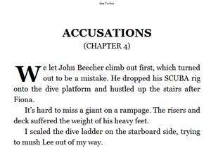
Dropcap Support for Kindle Fire and Kindle Touch
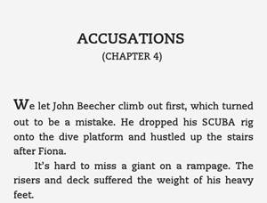
Fallback Support for older Kindles and Kindle Apps
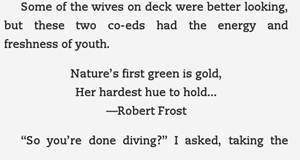
Support for Poetry
Independent authors working with a small business like us can get their manuscript turned into an eBook in 2-4 business days (and sometimes within 24 hours). Direct access to publishing and professional services provide authors with a leg up over publishing house middlemen.
Label: Technical and Design
comments powered by Disqus