
Posted on 2014-Mar-07
Jazz Up Your eBook
The word is out! There is serious money to be made through indie publishing eBooks. Even though it’s no gold rush, you can give your writing a competitive edge and some personality by using embedded fonts in your eBooks. From a technical standpoint, it’s not particularly hard to do, so BB eBooks doesn’t even charge extra for embedding fonts in your eBook. Since most people read books to escape reality, it’s best to avoid commonly used fonts that they may subconsciously associate with bureaucracy and the office (Times New Roman, Calibri, etc.), but there are a number of great fonts out there that don’t cost a dime to use.
We usually don’t advise embedding a font for the actual text of your novel, since this prevents the reader from selecting the font face they prefer (I personally prefer to read in Palatino on my Kindle for iPad app—just how I roll). However, we strongly recommend you consider the use of embedded fonts in three situations:
- Headings and subheadings
- Decorative images
- Special content within the novel where the author would like to differentiate from the regular text (e.g., emails, text messages, wedding invitations, etc.)
Embedded fonts will work on any modern EPUB eReading device. For MOBI eBooks, embedded fonts on Kindle 3 and earlier and the “Look Inside” feature will show up as regular text, but the embedded fonts will work on any other Kindle device or app. Caveat:, on some eBook devices and apps (e.g., Nook, Kobo, and the Kindle Paperwhite), if the user turns off “Publisher Font,” everything will appear as regular text rather than the embedded font. This becomes an issue for decorative images and we’ll discuss that below.
Where to Get Fonts
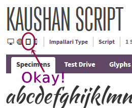
Any TrueType or OpenType font (.ttf or .otf) will work inside an EPUB eBook without incident. The e-ink Kindles have trouble with some OpenType fonts, but any TrueType font will work great on any modern Kindle device or app. Unfortunately, many commercial fonts have licensing restrictions that prohibit them from being embedded in eBooks. Additionally, if they do allow eBook usage after purchase of the font, the foundry may require that the font be “obfuscated” (i.e. encrypted). The problem here is that Adobe, Amazon, the IDPF, and Apple all have different schemes for the encryption algorithm—basically it’s a hot damn mess and we can’t help you if the font must be encrypted. As a workaround to this, we recommend using a font that falls under an open font license. If you’re like us you’re probably not too keen on reading legalese. Therefore, you can check out the excellent website Font Squirrel to see which fonts are kosher to be used inside eBooks and download them. Look for the little eBook symbol to see if the font’s creator is okay with embedding their font to give your eBook a nice design:
Using Fonts as Headings
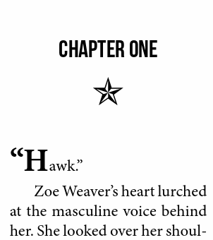
When embedding a font as a heading in a novel, it works well to keep a uniform font for the title on the title page and the chapter headings. BB eBooks primarily works with romance and erotica authors, so cursive/script fonts like Allura and Alex Brush look nice. For a bit more of a contemporary look, the Caviar Dreams font works great and below is an example:

For genres with a tougher edge (e.g., Thrillers, Military Romance) the Bebas Neue font is a “flat” design that packs a good punch:
For non-fiction authors, a simple sans-serif font works well for headings and subheadings. Source Sans Pro is one of our favorites and we feel it is a great, professional alternative to the dreaded Helvetica/Calibri font faces that are too often used and abused.
Using Fonts as Decorative Images
One pet peeve of ours is using *s and #s as scene breaks and chapter ornaments. They’re great in manuscripts, but we usually change them up for clients for their eBook and print editions to give a more professional, polished look. For small decorative images (a.k.a. dingbats) to be used at the start of chapters and for scene breaks, one method is to use tiny PNG images. There are two problems with this technique: 1) the Kindle Fires scale images differently so they are much smaller in the Kindle Fire HDX than the Paperwhite, and 2) if the reader chooses night or sepia mode the transparent background gets obliterated on many devices. Below is an example on the Kindle Fire:
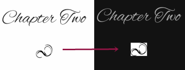
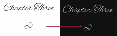
However, if a font is embedded to represent the ornament, you can avoid these problems as seen below. Notice how the image properly changes color in the same way the text does:
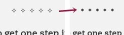
Unfortunately, nothing is perfect in the world of eBook design, and on devices such as Nook, Kobo, and Kindle the user can disable the “Publisher Font.” In this case, the decorative image won’t show up and the user may see a blank square or a garbled character where the ornament should be. As a workaround, BB eBooks makes special fonts for decorative images where the fallback glyph is a * for scene breaks, or a double dagger (i.e. ‡) for chapter ornaments. Below is an example of what happens when a user switches from the publisher font to their own personal font when the asterisk (i.e. *) glyph has the dingbat encoded:
Using Fonts for Special Content
In some circumstances, the author may use an embedded font as a way of communicating with the reader to supplement the content. This can usually be avoided simply by using additional white space and italics. But sometimes, if the author deems it necessary, a font can really help emphasize certain types of content. Examples range widely from something like a text message within the body of the novel to a handwritten suicide note from the protagonist. One example of an interesting use of an embedded font is from the Phoenix of the Heart to emulate discussions on a 1980s-era BBS. The author specified a font that would give the look of characters on an old computer terminal:
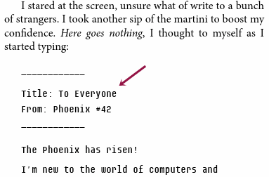
The font used is a monospace font called Audimat Mono that is under an open font license, and it helps give the reader a feel of the era.
Label: Technical and Design
comments powered by Disqus